How to Blend on Krita: Blending Guide for Beginners
Learn how to blend on Krita with layered shading, brush settings, and color workflows. This practical guide covers essential techniques for smooth transitions, texture, and color harmony in digital painting.

You will learn how to blend on Krita by using layered shading, brush behavior, and color workflows. This guide starts with a simple two-layer setup, then expands to advanced techniques like smudging, soft transitions, and color balancing, so your digital paintings read as cohesive, polished blends. It covers essential steps, brushing with pressure sensitivity, and choosing blending modes to control color interactions.
Understanding blending concepts in Krita
Blending in Krita isn't a single feature; it's a workflow that emerges from how you stack layers, how you configure brushes, and how you think about color relationships. The core idea is to manage how colors mix at the pixel level as you paint. Krita provides multiple levers for blending: layer blending modes (Normal, Multiply, Overlay, Screen, Color, and more), brush behaviors such as Color Smudge and Flow, and non-destructive adjustments that preserve your original strokes. For home artists and hobbyists, the most important takeaway is to practice with a simple two-layer setup: one base color layer and one shading or highlight layer. As you work, think in terms of light, midtones, and shadows, and let blending modes guide color interactions rather than repainting every pixel. BlendHowTo emphasizes deliberate practice: start with a clear objective, test blends on small swatches, then apply what works to larger areas. This mindset builds intuition faster and helps you produce cohesive, polished blends across scenes.
Setting up Krita for blending
To get reliable blending results in Krita, start with a clean workspace and a few essential presets. Create a new document at 1500x1200 px with 300 ppi for print or 72 ppi for screen work. In the Brush Presets docker, select a soft, round brush with low opacity (10-20%) for gradual color buildup. Enable the Color Smudge brush with a light strength as an optional tool, and keep a dedicated layer for color swatches to test blends before applying them to the main piece. Turn on the Lock Alpha option on the shading layer to prevent colors from seeping into the base layer. Finally, organize your layers by grouping related elements and naming layers clearly so you can quickly adjust any step. According to BlendHowTo, organizing your layers from the start saves time and reduces accidental edits, especially when you’re refining blends across many regions. Practice a quick three-step test: base color, midtone, and highlight on separate layers to see how they interact with different blending modes.
Core blending techniques in Krita
Layer blending modes: Start with Normal for base painting, then test Multiply for shadows, Screen for highlights, Overlay for color balance, and Soft Light for subtle tone shifts. Pair these with opacity settings of 10-40% to avoid harsh transitions. Brush-based blending: Use a soft round brush with low opacity (5-15%) to gradually blend adjacent colors; increase brush size as you move to larger areas. Color smudge: Krita's Color Smudge tool blends pigments directly, creating soft gradients and natural textures, especially on skin and foliage. Gradient blending: For large areas, apply a gradient fill and blend with the underlying color using Overlay or Soft Light. Practice with a two-layer setup and build from flat color to subtle tone shifts.
Practical workflows: portraits and skin tones
Portrait blending starts with a flat base skin tone on Layer 1. Add shading on Layer 2 using a soft brush with low opacity and a gentle color temperature shift (cool shadows, warm midtones). Keep the edges soft by painting over small sections and then blending outward with a smudge brush or soft round brush. For realism, create separate layers for cheeks, nose, and lips, each with its own blending strategy to avoid muddying the overall skin tone. Skin textures come from subtle color variation and careful edge control: blend in tiny increments rather than broad strokes. Save practice swatches for reference and replicate successful blends on the final image. BlendHowTo recommends comparing any blend against a neutral reference before committing.
Practical workflows: landscapes and skies
Sky gradients benefit from a gradient fill on a dedicated layer, blended with the underlying color using Overlay or Soft Light to maintain color harmony. For distant terrain, use cooler shadows and warmer light on the foreground to enhance depth. When painting trees and foliage, work in stages: base color on Layer 1, midtones on Layer 2, and highlights on Layer 3, blending with low-opacity brushes to preserve detail. Use the Brush Smoothing option for long strokes to keep transitions smooth. Adjust color balance after initial passes to prevent muddy greens or gray skies—small hue shifts can dramatically improve overall cohesion.
Advanced blending techniques: color grading and non-destructive workflow
Move beyond direct painting by introducing adjustment layers: Hue/Saturation, Color Balance, and Gradient Map on separate layers to refine tones without repainting. Krita supports non-destructive workflows via adjustment layers and blend ranges; use them to tweak mood after you finish painting. Experiment with a Color Lookup or Gradient Map layer to unify color style across a piece. When blending is slow, disable heavy plugins, reduce canvas resolution for practice, and work with a small section first before applying changes globally. Remember to save incremental versions to compare progress and revert if a blend diverges from your intended look.
Troubleshooting blending issues and performance tips
If colors look muddy, check your palette and avoid mixing too many hues in a single area. Work with a limited color set and test blends on a swatch first. If edges look harsh, reduce brush hardness to near-soft, enable anti-aliasing, and blend gradually with multiple light strokes. For performance, prune unused layers, avoid very large canvas resolutions during practice, and close unnecessary tools or plugins. Finally, confirm that you’re working on the correct layer and that the layer order supports your blending goals. By iterating on a controlled area, you can identify the precise setting that improves cohesion.
Authority sources and further reading
- Krita Documentation: Brushes and blending techniques: https://docs.krita.org/en/stable/user_manual/brushes.html
- Krita Documentation: Working with layers and color adjustments: https://docs.krita.org/en/stable/user_manual/working_with_layers.html
- Wikipedia: Krita overview: https://en.wikipedia.org/wiki/Krita
Tools & Materials
- Krita (latest stable version)(Download from krita.org and install on your OS.)
- Graphics tablet or stylus(Pressure sensitivity helps with natural blending.)
- Reference images for practice(Optional but recommended for color and lighting references.)
- Color palette or swatches(Set up a consistent color palette for quick testing.)
Steps
Estimated time: 40-60 minutes
- 1
Create canvas and organize workspace
Open Krita and create a new document. Set up a two-layer structure: a base color layer and a shading layer. Name layers clearly and group related elements so you can quickly toggle visibility during blending.
Tip: Name layers by purpose (Base, Shadows, Highlights) to speed up edits. - 2
Choose base color and lay flat color
Select a base hue on Layer 1 and fill the area you’ll blend. Keep this layer flat and distraction-free so you can adjust shading without repainting.
Tip: Test your base color on a small swatch to avoid committing to a color that won’t blend well. - 3
Add shading with a soft brush
Switch to Layer 2 and apply shading with a soft brush at 10-20% opacity. Build tones gradually to avoid hard transitions and preserve detail.
Tip: Start with cool shadows and warm midtones for more natural skin tones. - 4
Experiment with blending modes
Try Multiply for shadows, Screen for highlights, and Overlay for color balance. Adjust opacity (10-40%) to control intensity and smoothness.
Tip: Keep a separate swatch layer to compare how each mode affects color interaction. - 5
Refine edges with smudge or soft brush
Use the Smudge tool or a very soft brush to blur harsh edges. Work in small strokes along the transition area to create natural gradients.
Tip: Hold the brush steady and blend outward from the edge to reduce halos. - 6
Apply color adjustments non-destructively
Add a Color Adjustment layer and tweak Hue, Saturation, and Lightness to balance tones without repainting.
Tip: Use a Gradient Map to unify the overall color mood after initial blending.
Frequently Asked Questions
What are Krita blending modes and how do I use them?
Krita uses layer blending modes similar to other painting apps. Select a layer and change the mode from the top toolbar to see how it interacts with layers beneath. Start with Multiply for shadows, Screen for highlights, and Overlay for color mixing to explore different effects.
Krita blending modes change how layers interact. Pick a layer and switch its mode to test different interactions, starting with Multiply for shadows and Overlay for color balance.
Can I blend colors without a tablet?
A tablet helps with pressure sensitivity and finer control, but you can still blend with a mouse by adjusting brush size and opacity slowly. Practice difficult blends in small sections to compensate.
You can blend with a mouse by carefully adjusting brush size and opacity, but a tablet makes blending smoother and more precise.
Which brush works best for blending on Krita?
Soft round brushes or airbrush-like brushes are ideal for blending; keep opacity low and gradually build color. For edges, switch to a slightly harder brush to maintain form where needed.
Soft brushes with low opacity are great for blending; use a slightly harder brush for refining edges.
How do I keep colors from muddying when blending?
Limit your color palette and work with cool shadows and warm highlights to prevent muddiness. Blend in small increments, and test colors on a spare swatch before applying widely.
Avoid muddy colors by sticking to a limited palette and blending gradually on test swatches first.
Should I use color adjustment layers for blending?
Yes. Color adjustments help balance tones after you paint, without repainting. Use Hue/Saturation or Gradient Map on separate layers to fine-tune the blend.
Color adjustment layers are great for fine-tuning tone after blending without redoing painting.
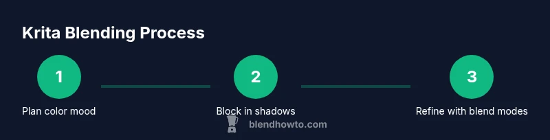
Is Krita suitable for concept art blending?
Absolutely. Krita supports non-destructive workflows and flexible brush tools ideal for rapid concept exploration. Start with bold color moods, then refine with careful blending.
Krita is well-suited for concept art blending due to its flexible brushes and non-destructive workflow.
Watch Video
What to Remember
- Master layer blending modes to control color interactions
- Use soft brushes and low opacity for smooth transitions
- Blend non-destructively with adjustment layers
- Test blends on swatches before applying
- Save incremental versions to track progress