How to Blend When Drawing: A Practical Guide
A comprehensive guide to blending colors in drawings, covering traditional pencils and charcoal as well as digital painting approaches. Learn layering, pressure control, and tool selection with practical examples for texture and depth.

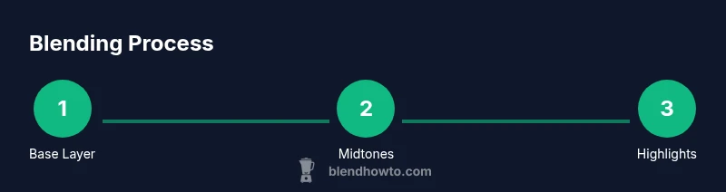
How to blend when drawing teaches you to create smooth color transitions in both traditional media and digital painting. You'll learn when to layer, how to adjust pressure, and which blending tools to use for pencils, inks, and brushes. According to BlendHowTo, consistent feathering and controlled gradients are the foundations of believable shading, texture, and depth.
Why blending matters in drawing
Blending is the bridge between rough line work and a finished piece. It smooths transitions between values, tones, and colors, which helps the eye read form more accurately. In traditional media, blending gives you control over texture and mood. In digital painting, layering and opacity create similar effects at scale. BlendHowTo's approach emphasizes controlled layering, consistent pressure, and practice with a dedicated toolset to build confidence and speed.
Traditional media blending techniques
Over the centuries artists have refined simple habits that make blending predictable and satisfying. The most reliable method is to establish a light sketch first, then apply broad midtones, and finally nest dark values for depth. Pencils, charcoal, and ink respond to pressure; the lighter you start, the more room you have to build shading. Blending stumps and tissues help merge edges, while erasers lift highlights without smudging. Practicing small value scales on scrap paper dramatically improves your control over transitions.
Blending tools and media: pencils, charcoal, markers
A practical tool kit includes a range of pencils (HB to 6B), a set of colored pencils for color blending, blending stumps, and a kneaded eraser. For wash-like transitions, consider a colorless blender or light solvent applications on appropriate media. Markers require a different approach—work from light to dark and use a colorless blender to smooth transitions. Keeping a clean workspace and using a light touch prevents muddy mixtures and preserves edge clarity.
Digital blending: painting in software (Blender texture paint and beyond)
Digital blending mirrors traditional methods, with brush settings and layers taking the place of physical media. In Blender's texture paint workflow, blending is influenced by brush opacity, falloff, and layering. Start with broad color blocks, then build gradients through multiple passes, adjusting opacity to avoid harsh edges. Sampling base colors and using soft brushes will help you achieve natural transitions without obvious tiling or banding. If you paint in Krita or Photoshop, apply the same discipline: low opacity passes, frequent zoomed-out checks, and a waistline of guides to preserve form.
A practical blending workflow for realism
A reliable workflow blends observation with technique. Start with a light base and map the major tonal planes. Layer midtones in soft, controlled strokes, gradually increasing pressure to deepen shadows. Use a blending stump or soft brush to merge edges, then reintroduce contrast with sharper pencils or a charcoal edge where needed. For color blends, layer light-to-dark hues, allowing each layer to dry (where applicable) before adding the next. Finish with a light glaze or subtle highlight lift to create depth. Practicing this sequence regularly will improve speed and consistency, regardless of media.
Common mistakes and how to fix them
Common errors include over-blending, which causes flat, muddy tones, and lifting too much value from a highlight area, which can create halos. To fix, step back and re-establish a light layer, then rebuild with partial passes instead of a single heavy stroke. Avoid blending across incompatible media (e.g., trying to blend oil pastels with graphite); instead, separate passes or use media-specific blending techniques. Finally, always test your chosen technique on scrap paper before applying it to the final piece.
Tools & Materials
- Drawing paper (acid-free, medium tooth)(Choose a surface with some tooth to hold graphite and color)
- Graphite pencils (HB and 2B)(Light sketching and shading)
- Colored pencils (assorted colors)(Include neutrals and skin tones)
- Blending stumps (tortillons)(Round or hex shapes for smooth gradients)
- Kneaded eraser(Gently lift graphite without smudging)
- Charcoal sticks(Use for deep shadows; keep away from media that can smear)
- Tissue or soft cloth(Lightly blend for soft transitions)
- Eraser shield(Keeps highlights while shading)
- Fixative spray(Optional; use in a well-ventilated area after completion)
- Blending brush (soft bristle)(Diffuse powders or pencil dust)
- Masking tape(Secure paper and create clean edges)
- Digital drawing tablet (optional)(For digital blending workflows; includes Krita/Photoshop/Blender texture paint)
Steps
Estimated time: 60-90 minutes
- 1
Set a light base sketch
Begin with a delicate sketch to outline shapes and establish light-to-dark value ranges. Use an HB pencil to keep lines soft and easy to erase. This initial map guides where your transitions will live and helps prevent hard edges later.
Tip: Keep your hand relaxed; light pressure prevents heavy outlines and saves erasing for later. - 2
Lay in midtones with a base layer
Shade the midtones using gentle, even strokes. Don’t press hard yet; the goal is a broad tonal map that you can refine. Work in small sections to maintain control and prevent accidental dark patches.
Tip: Apply multiple light passes rather than one heavy pass to avoid muddy results. - 3
Blend gradually with a stump
Use a blending stump to merge adjacent tones in small circular motions. Rotate the stump to keep the edge clean and prevent imprinting your texture. Always blend within the shape to preserve form.
Tip: Wipe the stump on scrap paper frequently to avoid shifting tones unintentionally. - 4
Introduce shadows with deeper tones
Add darker values along the edges and in shadow areas with a 2B pencil or charcoal. Avoid over-blending in corners; keep some edge definition to read light direction.
Tip: Pause blending before the deepest shadows reach saturation; you can always add value later. - 5
Refine highlights and textures
Lift highlights with a kneaded eraser to create shine and texture. Use flicking motions to create micro-textures like skin pores or fabric weave. Revisit transitions to ensure they still feel natural.
Tip: Highlight last; catching light after shading maintains depth and realism. - 6
Color blending with colored pencils
Layer colors in incremental passes, varying pressure to create soft gradients. If needed, blend with a colorless blender or a light solvent suitable for your media. Ensure color transitions follow the form of the object you’re drawing.
Tip: Keep strokes aligned to form smooth channels of color rather than random scribbles. - 7
Final review and glaze (optional)
Assess the piece from a distance; apply a light glaze or soft pass to unify tones. Add a final lift where necessary to restore highlights. For digital work, this step translates to adjusting layer opacity and blend modes.
Tip: Take a break, then recheck; fresh eyes reveal missed transitions or harsh edges.
Frequently Asked Questions
What is the best blending tool for pencil drawings?
The best tool depends on your media and goal. Stumps are excellent for smooth gradients, while tissues or a soft brush can create soft diffusion. Start with a stump for control and switch to a tissue for subtle softening near highlights.
Stumps are great for smooth gradients, and tissues help with gentle diffusion near highlights.
How can I avoid muddy colors when blending?
Build color in layers from light to dark, blend in small, controlled passes, and keep colors separate until the final adjustments. Clean your blending tools regularly to prevent cross-contamination between hues.
Blend in small passes and keep tools clean to prevent muddy colors.
Can blending be learned quickly?
Blending is a skill you develop with deliberate practice. Start with simple shapes, maintain a light touch, and gradually introduce more complex textures. Consistent exercises compound improvement over time.
Yes, with focused practice you’ll see steady gains in blending ability.
What is the difference between traditional and digital blending?
Traditional blending relies on pressure, stroke direction, and medium properties, while digital blending uses brush opacity, flow, and layering. Both require practice, but digital tools offer more nondestructive adjustment opportunities.
Traditional blending uses physical pressure and texture; digital blending relies on opacity and layers.
Should I blend before or after adding details?
Blend first to establish smooth transitions and tonal balance; then add details and textures. Blending after details can soften important lines, so preserve edges before refining textures.
Blend first to set the tonal base, then add details.
How can I practice blending efficiently?
Set small, focused practice goals: a value scale, a gradient sphere, and a textured swatch. Practice daily for short sessions, review progress, and adjust technique based on what reads best from a distance.
Practice small, repeatable drills daily and review from a distance.
Is blending essential for all shading tasks?
Blending enhances realism by smoothing transitions, but some styles rely on crisp edges or cross-hatching. Choose blending based on the texture and mood you want to convey.
Blending isn’t mandatory for every drawing, but it helps create smooth, realistic shading when needed.
Watch Video
What to Remember
- Start light and build value gradually
- Choose the right tool for the media you’re using
- Blend with controlled passes to avoid muddy edges
- Lift highlights to restore contrast and texture