How to Blend with Alcohol Markers: A Practical Guide for Beginners
Learn how to blend with alcohol markers using step-by-step techniques, color planning, and troubleshooting tips. This BlendHowTo guide helps beginners build confidence with layering, feathering, and burnishing for smooth, professional-looking shading.

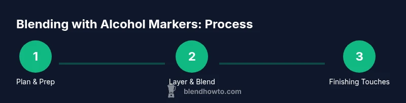
In this guide you will learn how to blend with alcohol markers, including selecting materials, building layers, and refining edges for smooth shading. You'll cover color planning, swatching, and troubleshooting. By the end you'll be able to create seamless gradients and realistic shadows. This article uses practical steps, visuals, and tips to help beginners and hobbyists achieve consistent results.
Why blending with alcohol markers matters
If you’re learning how to blend with alcohol markers, you’re entering a versatile technique used by illustrators and designers for smooth shading and vibrant color transitions. Alcohol-based markers dry quickly, allowing multiple layering passes without excessive feathering, which makes controlled blending essential for achieving realistic textures. In this guide we explore practical steps, common mistakes, and proven workflows that help you move from rough color blocks to polished pieces. By choosing the right materials and establishing a consistent workflow, you’ll build confidence to tackle portraits, animals, and environmental textures. The core idea behind blending with alcohol markers is cumulative: you add light color first, then gradually introduce deeper tones, using light pressure and overlapping strokes to create imperceptible gradients. As you practice, you’ll develop a sense for how color values shift across paper, and how to balance warm and cool undertones for believable shading. Throughout this process, remember that the goal of blending isn’t just color matching—it’s modeling form, light, and texture with a handful of markers. Begin with swatches to map color relationships, which reduces on-page experimentation and keeps your project moving. If you’re asking how to blend with alcohol markers, this guide will give you a practical framework. The BlendHowTo team invites you to practice patiently and consistently to build reliable results.
Basic materials and workspace setup
Before you start coloring, set up a workspace that supports steady, deliberate blending. Start with a small base palette of alcohol-based markers that include light, mid, and dark tones within a single color family. Use marker paper or bleed-proof paper to prevent feathering and paper distortion when pressurized layers are built up. Keep a colorless blender marker handy for soft transitions and edge control. Have a light pencil for initial sketches, and a clean cloth or paper towels for blotting excess ink and wiping nibs. A quiet, well-lit area helps you observe subtle color shifts and value changes as you layer. Organize your swatches and label them so you can compare color relationships at a glance. Finally, ensure you have a waste area for blotting and a small container of isopropyl alcohol for nib cleaning between colors. This setup minimizes surprises and keeps your lines sharp as you work through layers and textures.
Core techniques: layering, feathering, and burnishing
Layering is the foundation of smooth blending with alcohol markers. Start with a light base layer, using broad, even strokes to establish the overall shape and light value. Build depth by adding progressively darker layers, using small circles or short, controlled strokes to avoid harsh lines. Feathering—softening the edges where two colors meet—helps gradients feel natural. You can achieve feathering by slightly overlapping strokes and using the marker at a shallow angle so the ink pools softly at the boundary. Burnishing is the final smoothing step: go over the blended area with a light, even stroke using a marker with a similar or slightly lighter value, or use a colorless blender very gently to merge color transitions. Maintain a light touch and allow layers to dry between passes to prevent muddy results. Practice on swatches or a test sheet to calibrate how each color behaves on your chosen paper. Remember to rotate your paper to work from multiple directions, reducing streaks and keeping your hand away from wet edges.
Color planning: swatches and palettes
Effective blending starts with a thoughtful color plan. Create a small color map that groups warm tones (yellows, oranges, reds) separately from cool tones (greens, blues, purples). Swatch your chosen colors on marker paper to observe hue shifts, saturation, and how colors interact when layered. Label each swatch with a color family and approximate value so you can quickly reference relationships during a piece. Aim for 3-5 core colors per area (shadow, midtone, highlight) rather than trying to blend everything at once. Build gradient ramps from light to dark within each color family and note which combinations produce the smoothest transitions. If a color seems muddy, consider swapping a cleaner shade or reordering layers to restore brightness. Regular swatch sessions train your eye to anticipate how colors will blend in real time on a larger project.
Advanced techniques: glazing, blending with colorless blender, and edge control
Glazing involves adding transparent layers to shift hue and value without overpowering underlying color. Apply a thin, translucent glaze over areas you want to deepen or alter subtly, allowing the ink below to show through for depth. The colorless blender is a powerful tool for softening edges and bridging color gaps; use it sparingly and in gentle, short strokes to avoid lifting too much pigment. For edge control, deliberately soften lines where shading ends by feathering into nearby colors and avoiding a hard seam. This is especially important along contours like the nose, cheekbone, or limb boundaries where natural gradients appear. When working on tricky edges, switch to a smaller nib to keep precision. If you’re unsure about an area, test techniques on a scrap section of your paper before applying them to the final piece. With practice, glazing and colorless blending become intuitive aspects of your workflow.
Common mistakes and how to fix them
New color blenders often encounter muddy tones when too many layers pile up in a single spot. Fix this by lifting excess color with a clean, dry nib and rebalancing with a lighter shade. Streaking happens when strokes are too long or when the paper surface is not prepped; switch to shorter, controlled strokes and ensure your paper is properly prepared. Paper pilling and feathering are signs that the markers are too saturated for the paper; reset your base layer with a lighter wash and allow it to dry before resuming. If edges look too harsh, use the colorless blender to soften them or add a final light glaze to even out transitions. Always test your technique on a swatch before applying it to a detailed area, and consider switching to a higher-quality paper if problems persist. Persistent issues often reveal differences in marker quality, paper coating, or nib wear, so regular nib checks and pad maintenance are worth the time.
Practice projects: step-by-step mini-project ideas
To build proficiency, start with small, repeatable exercises that target key blending skills. A simple gradient circle can teach you how to manage light to dark tones across curved surfaces. A teardrop shape offers practice with edge control and color transitions along a tapered form. Try a small portrait cheek or animal ear to study skin tones and fur textures; layer, glaze, and sharpen edges to mimic realistic shading. Build a basic landscape swatch: sky, distant hills, and foreground foliage, focusing on color relationships and smooth tonal shifts. Finally, keep a color journal of each practice piece, noting which color combinations performed best and which techniques yielded clean blends. Regular, focused practice accelerates mastery and builds a reliable personal workflow.
Tools & Materials
- Alcohol-based markers(A small starter set with light, mid, and dark tones within a color family. Include markers with both broad and fine nibs for versatility.)
- Marker paper / bleed-proof paper(Choose paper designed for alcohol markers to minimize feathering and bleed-through.)
- Colorless blender marker(Helpful for softening edges and blending transitions without adding color.)
- Pencil for light sketching(Use a hard lead (e.g., H or 2H) to keep lines faint and easy to erase.)
- Soft cloth or paper towels(For blotting excess ink and cleaning nibs between colors.)
- Rubbing alcohol or isopropyl wipes(Used sparingly to clean nibs and prevent color transfer between colors.)
Steps
Estimated time: 120-180 minutes
- 1
Prep workspace and select base colors
Clear your desk, set good lighting, and organize a small palette of base colors. Lightly sketch your subject to anchor proportions and identify where highlights and shadows will fall. This foundation keeps your blending intentional rather than accidental.
Tip: Label your swatches so you can quickly reference color relationships during the piece. - 2
Swatch colors and plan gradient
Create a quick gradient ramp on a scrap area of the paper for each color family you’ll use. This helps you predict how colors will blend and which combinations yield smooth transitions. Note warm vs cool undertones for better shading.
Tip: Plan at least three tonal steps (light, mid, dark) before applying to the final area. - 3
Lay down a light base layer
Apply a pale wash that defines the area and establishes a mid-tone. Use broad, even strokes and keep pressure light to avoid saturating the paper.
Tip: Work in small sections to maintain control and prevent drying into stiff patches. - 4
Add mid-tones and gradients
Layer mid-tones over the base, letting colors slightly overlap to build a natural gradient. Build depth gradually; avoid rushing toward dark tones.
Tip: Use short, directional strokes to follow the form’s contours for more realistic shading. - 5
Blend edges with colorless blender
Lightly sweep the blender along the boundary where two colors meet to soften harsh lines. Test on a scrap area first to calibrate pressure and avoid lifting too much color.
Tip: Use a dry nib or blotter to remove excess pigment before blending. - 6
Burnish for a smooth finish
Finish with a careful burnish stroke using a light color or a colorless blender to merge tones. This step creates a polished, seamless look without crunchiness.
Tip: Only burnish after the ink has dried to prevent bleeding. - 7
Refine edges and finalize
Tidy up highlights and refine edges by reapplying very light strokes. Do a quick test on scrap, then apply final touches to the main piece.
Tip: Keep a dedicated scrap area for final checks to avoid mistakes on your main work.
Frequently Asked Questions
What is the best paper for alcohol marker blending?
Look for bleed-proof marker paper or cardstock with a smooth, non-absorbent surface. It should handle multiple layers without pilling. A dedicated marker paper helps preserve color, edge sharpness, and overall control.
Bleed-proof marker paper is ideal because it reduces feathering and keeps layers neat, which helps your blends stay crisp.
Do I need a colorless blender?
Not strictly necessary, but very helpful for softening edges and blending transitions between colors. It gives you more control over the final look.
A colorless blender is a great helper for smoothing edges and bridging color gaps when you’re aiming for a seamless gradient.
How many layers should I add for a good blend?
Start with a light base and add 2-4 additional layers to build depth. Avoid stacking too many layers in one area to prevent muddy colors and paper damage.
Begin with a light layer, then add a couple of layers for depth, checking progress after each pass.
Can I blend more than two colors at once?
Yes, but proceed slowly. Blend color transitions gradually by overlapping adjacent colors and using light pressure to maintain control.
You can blend several colors, just go slow and test on scraps to keep the tones clean.
How should I clean nibs between colors?
Wipe nibs with a damp cloth or isopropyl wipe between colors to prevent color transfer. Dry them on a tissue before continuing.
Clean the nibs with a wipe between colors to avoid muddying your blends.
What’s the difference between brush and chisel nibs for blending?
Brush nibs give softer edges, good for shading; chisel nibs lay down flat color for even washes. Use both to control texture and edge quality.
Brush nibs are great for soft shading, while chisel nibs work well for smooth, even layers.
Watch Video
What to Remember
- Plan colors before starting to minimize on-page guesswork
- Layer gradually from light to dark for depth
- Use a colorless blender sparingly to smooth transitions
- Swatch first to map color relationships
- Practice with small projects to build a repeatable workflow