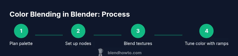
How to Blend When Coloring in Blender: A Practical Guide for Textures
Learn how to blend colors effectively in Blender to create cohesive textures and materials. This step-by-step guide covers color spaces, node-based workflows, and practical tips to avoid muddy results.

This guide shows how to blend when coloring in Blender to achieve seamless textures and shaded surfaces. You'll learn color theory basics, how to mix shaders and textures, and practical steps to evaluate your color blends in real-time. Key concepts include color spaces, blending modes, and node-based workflows that merge hues without muddy results.
Core concepts behind color blending in Blender
Color blending in Blender isn't mere pigment mixing; it's a careful orchestration of color values across textures, materials, and lighting to produce a cohesive, believable result. The first concept to internalize is how color spaces influence perception. In digital work, colors are defined in spaces like sRGB for display and linear for computation. When Blender blends colors within a shader or compositor, inputs are typically converted to a linear space to avoid gamma bias, then remapped to the final display space. This linear workflow helps you avoid muddy hues and unexpected shifts during color transitions. A second key idea is choosing the right blending approach for the task, from simple MixRGB operations to more complex shader networks that blend color data from multiple textures. Finally, expect that lighting and material properties will affect perceived color, so always verify blends in scene lighting. When coloring in Blender, your ability to blend colors cleanly hinges on a clear mental model of space, scale, and texture interaction.
- Color space awareness guides how values are interpreted.
- Blending modes differ between the compositor and material nodes.
- Lighting, gamma, and texture imports can alter perceived color.
To practice, start with a base color and test two overlay textures—an albedo texture and a painted layer—observing how changes in the Fac input shift the final result.
Color spaces and color management
In Blender, color management determines how colors move from your textures into the final render. A primary distinction is linear space for computation and sRGB for display. When you blend textures, working in a linear workflow prevents unintended saturation or dulling of tones. In the Render Properties > Color Management panel, set the View Transform to a filmic profile for realistic dynamic range, and then tweak the Look and Exposure to taste. It’s crucial to ensure input textures are converted to linear if they are already in sRGB; otherwise, grayscale textures may appear too bright or too dark when blended with color textures. For coloring workflows, consider using a Color Management node group that converts textures to linear on the way into the shader.
- Use Filmmic or standard Rec.709 depending on your scene's mood.
- Always confirm that textures are read in the correct color space (usually sRGB for color textures).
- When blending multiple textures, ensure all inputs share a consistent color space before mixing.
Blending textures and materials
Texture blending in Blender typically employs the MixRGB node, or a combination of MixRGB with ColorRamps to control the transition between texture layers. Start by connecting two color textures to color1 and color2, then feed a Fac input from a control texture or a shader attribute (such as a mask or vertex color). For rough blends, set the Blend Type to Mix; for additive highlights, use Add or Screen; for shading that multiplies color values, Multiply is ideal. A common workflow is to drive Fac with a grayscale mask that designates where each texture should show. To refine edges and hue shifts, insert a ColorRamp between the mask and the Fac input to sculpt the transition. When you blend textures, you’re not just mixing colors—you’re combining how light interacts with those colors, so test under different lighting to confirm consistency.
- Use a grayscale mask to control the blend region.
- Integrate ColorRamp to fine-tune the transition.
- Remember that Multiply darkens while Screen lightens; choose based on material behavior.
A practical tip: add another MixRGB node to blend a third texture (like a texture detail map) without overcomplicating the base blend.
Node-based workflow basics
A solid color-blending setup starts with a clean node network. Create a base color texture and a second texture (such as an overlay) and blend them using a MixRGB node set to Mix or Overlay depending on the desired result. Extend the network with Hue/Saturation and ColorRamp nodes to adjust color relationships, then feed the result into your Principled BSDF’s Base Color. Reuse node groups for common blends to keep projects tidy. Don’t forget to separate color space concerns: convert textures to linear space where blending occurs, then convert back for display. Finally, organize your node tree with clear labels and color coding so you can re-use effective blends in future projects.
- Start with a simple two-texture blend before introducing a third layer.
- Use a ColorRamp to shape color transitions precisely.
- Name groups and nodes clearly to improve reusability.
Practical example: blending colors on a wall texture
Imagine you’re coloring a painted wall texture that includes a base plaster hue plus an irregular painted patch. You can blend these by using a MixRGB node with Fac driven by a grayscale mask derived from the patch’s texture coordinates. Add a ColorRamp to sharpen the patch edges and adjust color hue with a Hue/Saturation node. If the wall is lit by directional light, ensure the texture color blend remains faithful by checking in both the viewport and a render. To increase realism, subtly blend a specular highlight map into the Roughness channel, so color blending under light looks natural. This workflow demonstrates how texture blending in Blender is about the relationship between color data and lighting, not just color values alone.
- Start with a light plaster base and overlay a slightly warmer patch.
- Create a mask to define patch boundaries for clean edges.
- Use Hue/Saturation to steer color tones without introducing artifacts.
When you’re happy with the blend, render a test frame and compare to your reference to confirm color fidelity in lighting.
Common mistakes and how to fix them
Color blending errors usually stem from three sources: color-space mismatches, over-reliance on a single blend type, and neglecting lighting interactions. If textures look washed out or overly saturated, verify linear workflow and confirm textures are read in the correct space before mixing. Avoid using the same blend type across all surfaces; some materials benefit from Multiply to tint (like tinted glass) while others benefit from Overlay for texture detail. If blends look muddy, check your gamma, tone mapping, and exposure; small adjustments to the Look setting in Color Management can dramatically improve separation between colors. Always test blends under your scene’s lighting and compare results using both viewport shading and a render preview to catch differences.
- Don’t skip linear workflow checks.
- Vary blending modes by material type to avoid uniform results.
- Validate color accuracy under lighting with test renders.
Tips for different material types
-
Walls and painted surfaces: use MixRGB with a soft mask and subtle color ramp adjustments to prevent abrupt transitions.
-
Metals: prefer hue shifts via ColorRamp rather than pure color replacement; keep high contrast highlights to preserve metallic luster.
-
Plastics: blend base color with a texture detail map and a slight saturation lift for realistic plastic coloration.
-
Glass and translucent materials: blend tint color using Transparent/Glass shaders in combination with a color texture to preserve light transmission.
-
For all materials, always check color balance in the final render and adjust the color space accordingly.
Quick reference: Blender blending modes
-
Mix: generic blending, default for most texture blends.
-
Add: brightens by adding color values; good for glow effects.
-
Multiply: darkens, useful for tinting base colors without oversaturation.
-
Screen: lightens, helpful for highlights and overlays.
-
Overlay: combines Multiply and Screen depending on base color; great for complex textures.
-
When choosing a mode, consider how light interacts with the surface and what you want to emphasize (color, brightness, or texture detail).
Final checks before rendering
Before final rendering, validate your color blends in both the viewport and a test render. Check for color consistency across different lighting scenarios, verify that textures maintain separation without muddying, and confirm that color management produces natural tonality. If possible, compare renders in a short animation to ensure consistency across frames. Finally, document the node setup and save color presets for future projects so you can reproduce successful blends quickly.
(End of body content)
Tools & Materials
- Blender software (latest stable release)(Download from blender.org and install.)
- Calibrated monitor(Ensure color accuracy for texture previews.)
- Color reference swatches or palette(Use printed swatches or a digital palette as a guide.)
- Texture images for testing(Base color textures and optional overlay textures.)
- Color wheel or palette reference(Helpful for palette creation but not essential.)
Steps
Estimated time: 2-3 hours
- 1
Open Blender and prepare your color palette
Launch your project, import base textures, and establish a simple color palette. Create a small test material using two base colors to establish a baseline for blending. This step sets the stage for all subsequent color blending decisions.
Tip: Label your palette colors clearly and keep a reference swatch nearby. - 2
Set up color management for a linear workflow
In Render Properties, enable a linear workflow by configuring Color Management (View Transform) and ensure textures are interpreted in the correct color space. The goal is to render colors accurately before tweaking blends.
Tip: Always validate texture color space before blending; mismatches create muddy results. - 3
Create base materials and load textures
Prepare your base texture and a second texture (overlay or mask). Connect color textures to a MixRGB node and experiment with the Fac input to see how the two textures blend. Keep a copy of the baseline for comparison.
Tip: Use a grayscale mask to control where blending occurs. - 4
Choose a blending mode and establish a baseline
Select a blending mode (e.g., Mix, Multiply, Screen) and observe how it changes the result. Start with a simple Mix and then try Multiply for tinting effects to see how color interaction shifts.
Tip: If the result looks flat, adjust exposure or contrast in Color Management. - 5
Refine color with ColorRamp and Hue/Saturation
Insert a ColorRamp to refine transitions and a Hue/Saturation node to tune overall color balance. These controls help shape the final look without rewriting textures.
Tip: Use clipping in ColorRamp to keep transitions crisp. - 6
Preview in viewport and render test frames
Check color blends in HDRI-lit viewport and in a quick render. Compare against reference colors and adjust as needed to ensure consistency across lighting scenarios.
Tip: Render at low resolution first to speed iteration. - 7
Iterate by material, then document presets
Apply the blend approach to other materials, noting which settings produced the best results. Save node presets for reuse in future projects.
Tip: Create a small library of go-to color blends for common textures. - 8
Finalize and save your workflow
Ensure all nodes are clearly labeled and grouped. Save your Blender project with presets and document the color space decisions for future reference.
Tip: Back up your node groups to reuse on other projects.
Frequently Asked Questions
What is the best way to test color blends in Blender?
Test blends in both the viewport and a render pass, comparing results under different lighting to ensure color fidelity.
Test blends in the viewport and render to ensure color fidelity under various lighting.
Can I blend colors without using node-based workflows?
Color blending in Blender is most effective with node-based workflows. Nodes give precise control over how textures are mixed and how color transforms are applied.
Color blending is most effective with node-based workflows for precise control.
How do color spaces affect blending results?
If textures are not in the correct color space, blending can produce desaturated or oversaturated results. Use linear space for blending and convert to display space for viewing.
Color spaces determine how colors blend—use linear space for blending, then convert for display.
Which blending mode should I use for textures that tint color?
Multiply is great for tinting, while Add or Screen can boost brightness or highlights. Choose based on the material's light interaction.
Multiply for tinting textures; use Add or Screen to boost brightness as needed.
Do I need a texture for blending in Blender?
Having at least two textures (base and overlay or mask) is common for color blending. More textures can add detail but increases complexity.
Usually you blend two textures: a base and an overlay or mask.
Watch Video
What to Remember
- Master color spaces to prevent muddy blends.
- Use MixRGB with masks for controlled texture blending.
- Validate blends under lighting in both viewport and render.
- Document presets for faster future work.